Screenshots that Сonvert: the Secrets of Visual ASO | Mobio Group
How to convince a potential user to choose your app in the store among many competitors’ apps? The main thing is to make it stand out. Mobio Group team is sure that the key to success is a well-thought-out ASO strategy and, in particular, visual design. In this article we will share examples of app pages that we have implemented for our clients and that really work.
We never tire of asserting that ASO is the foundation of successful app promotion. A well-configured ASO is a great organic traffic channel in itself, as well as a necessary base for launching successful advertising campaigns.
The app page in the store is the last link before the app is installed, and it doesn’t matter what traffic source the user came from — the decision to install will be made here. Therefore, it is extremely important that from the first seconds the user understands what the app is for, can quickly find answers to the questions he is interested in (app functionality, interface, its advantages over competitors) and wants to download it.
First impressions are the most important
Text optimization is important because it directly affects search engine ranking and the growth of organic installs. But users rarely read the full description of the app, and screenshots come to the fore. It is important that all the necessary information can be easily read from them, and the visual elements have high-quality graphics. Screenshots should reflect the brand message, hook the user and motivate them to install the app.
At the same time, visual ASO is not primarily about design, but about strategizing how to present the app to the user and positioning the brand. That’s why in Mobio Group the work on the app page starts with an audit of the client’s category. We analyze the pages of the nearest competitors: what UTPs they contain, what they focus on in the first screenshots, the overall design of the page. Then we look a little wider — at apps with similar themes. The purpose of such an analysis is, on the one hand, to understand what users like and what attracts them, and on the other hand, it is important to set yourself apart from competitors and offer users something unique.
At the next stage, we review the offers of the promoted app and determine in what order they should be shown. Having formed the UTP and the order of screenshots, we start copywriting. At the same time, details that seem small at first glance are very important in ASO. The same UTP can be delivered in different ways, and it will work in different ways too. Or offers — in some cases it is better to specify the offered bonuses and discounts, in other cases more general formulations are effective.
Only after detailed and careful elaboration of copywriting we move to the design of visuals. Here, too, there are many nuances — a slightly different shade of color, size, location or font of the text, and the effectiveness of the page changes. To identify the most successful combinations, A/B tests are conducted.
Mobio Group team pays much attention to deep elaboration of both textual and visual components of ASO, and in this article we decided to share examples of our creative department’s work on visual design of app pages.
Catch the Eye and Gain Trust:
How to Make Your App Stand Out in the Store
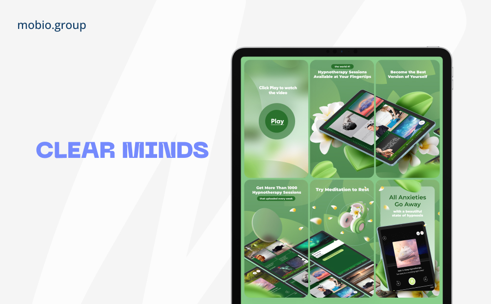
➲ Video Preview
A dynamic video demonstrating the key features and benefits of your app can be a deciding factor for the user.
Clear Minds Hypnotherapy is a hypnotherapy and meditation app that improves quality of life and helps you break bad habits, stress and anxiety.
We created a video preview that shows what the sessions look like and highlights the most popular ones, and added 3D background graphics for screenshot design, which allowed the app to stand out in its category and tell users about its functionality.
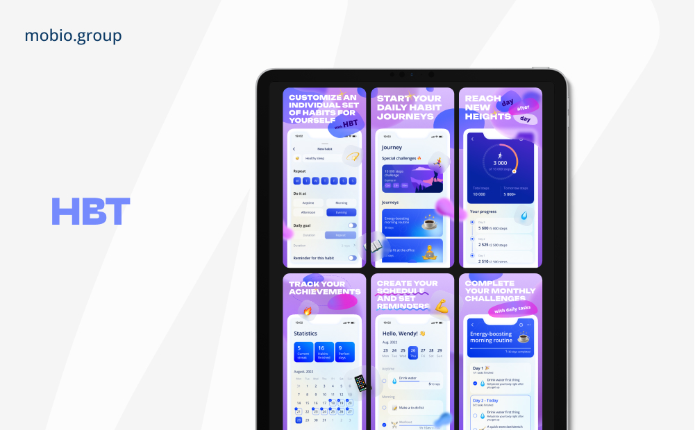
➲ Informative design
A clever structure of screenshots with emphasis on important elements helps the user to quickly navigate and understand the value of the app.
HBT is a user-friendly habit tracker app designed to help users improve their daily lives.
The app has many features, so we designed screenshots that emphasize the intuitive interface and wide functionality of the product.
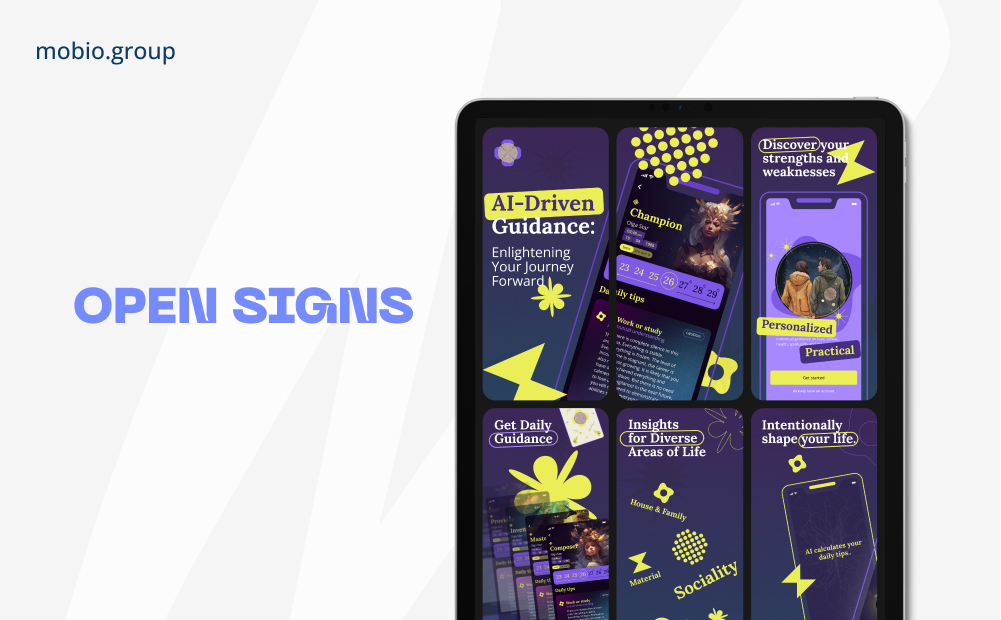
➲ Style matching
The visual design of the app page should harmonize with the brand and its positioning.
Open Signs is an astrological app based on artificial intelligence, developed by Mobio Group.
We emphasized on a young audience interested in Eastern culture, but accustomed to technology. In the design we reflected the visual style of the app, and on the first two screens we emphasized that the predictions were made with AI.
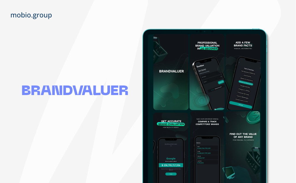
BrandValuer is a brand value tool that utilizes a Royalty Relief & Discounted Cash Flow approach.
We have developed screenshots that demonstrate the user-friendliness and brevity of the interface, the technology of Brand Value and contribute to the memorability of the brand as a whole.
➲ Understanding the target audience
Studying the audience, tastes, preferences and interests of users helps create a design that is eye-catching, trustworthy and encourages installation.
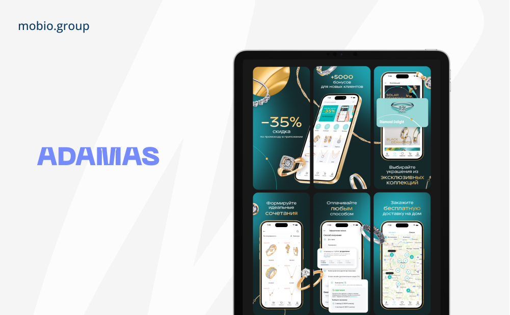
ADAMAS is a jewelry brand, where you can find the perfect piece of jewelry for any occasion.
When designing the screens for the ADAMAS brand, the main objective was to emphasize the benefits of shopping through the app, while maintaining the premium and exclusive nature of the brand.
➲ Bright and intense screenshots
Attractive screenshots that clearly illustrate the app’s features, interface and UTP can intrigue and motivate to install. They work especially well with a young audience.
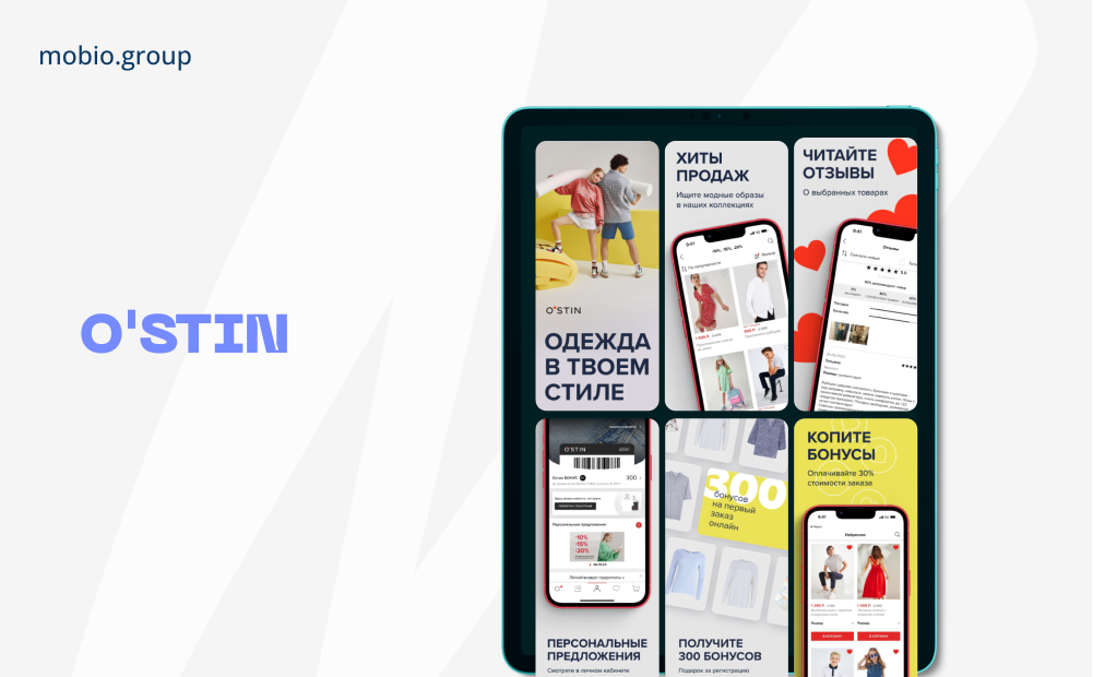
O’STIN is an international brand that has been offering customers a wide range of modern and affordable casual clothing for women, men and children for over 18 years.
We updated the screenshots for the popular clothing brand O’STIN for the summer collection. We kept the brand’s image communication and used effective UTPs on the first screenshots, which favorably affects the conversion rate.
As you can see from the examples, all apps are different and there can be no universal recipe. If a colorful design and video preview works well for one, the best solution for another is a lot of screenshots showing the app’s features.
«Depending on what kind of product comes in, ASO’s task can change significantly. So, for example, if a new app comes to us, especially if the functionality is even slightly non-standard, then first of all we make a video preview, in which we explain in great detail what it is. And the whole ASO storytelling will be based on the fact that users don’t know the brand yet, and our task is to tell them about the product. This is exactly the principle behind the ASO for Clear Minds Hypnotherapy.
Another task, quite the opposite, when working with large and well-known brands, which have rigid guides, their own tone of voice communication, certain marketing objectives. And very often all of this actually contradicts what is welcomed in ASO. Then we look for compromises and find them in different ways with different brands.
All the visuals shown above were developed taking into account different nuances on the part of clients: brand positioning is more important to some, another — to tell about the functionality, and someone is constantly running various promotions, and we often change the first screenshots.
It is important not just to make beautiful pictures/videos, but to work out the visual design of the app page: to reflect the purpose, functionality and UTP of the product, to study competitors and stand out among them, to take into account the nature of the brand, the audience the app is aimed at and the client’s marketing objectives».
Olga Mazur, creative director, Mobio Group
Investing in quality ASO development helps to bring the app to the top positions for relevant search queries and increase conversion to installs.
- 72% of app users focus on screenshots when deciding to download an app
- Video previews increase conversions by 20%
- ASO can help reduce user acquisition costs by 50%
- Using regular updates to app pages in stores can increase downloads by 20%
Soures: App Annie, Bootcamp, apptamin.
ASO is the foundation of advancement. And it is not a one-time task, but a continuous process. By constantly improving your ASO strategy, you will be able to improve the visibility and number of downloads of your app.
Want to Learn More About ASO?
In our series of articles, you’ll find even more information on how to optimize your app’s in-store page and increase organic installs.
The Mobio Group team is ready to help develop an effective ASO strategy for your app. Contact us today to learn more.